A lot has changed recently. Due to the pandemic, budgets have been cut or adjusted. Positions within companies have been laid off. Though we’re starting to see a rebound, it’ll likely take time to fully recover.
In the meantime, your business might not be allocating pandemic small business loans or extra funds on design. Or maybe you’re just starting out and don’t have the resources yet. While the benefits of professional graphic design are countless, it may not currently be in the cards. No matter your situation, here are some tips to keep in mind when creating diy marketing for a small business.
Creating DIY Marketing for a Small Business
If you are opting out of professional design services for the time being, consider these basic elements and principles of design to help you maintain a professional look.
What Not To Do Yourself
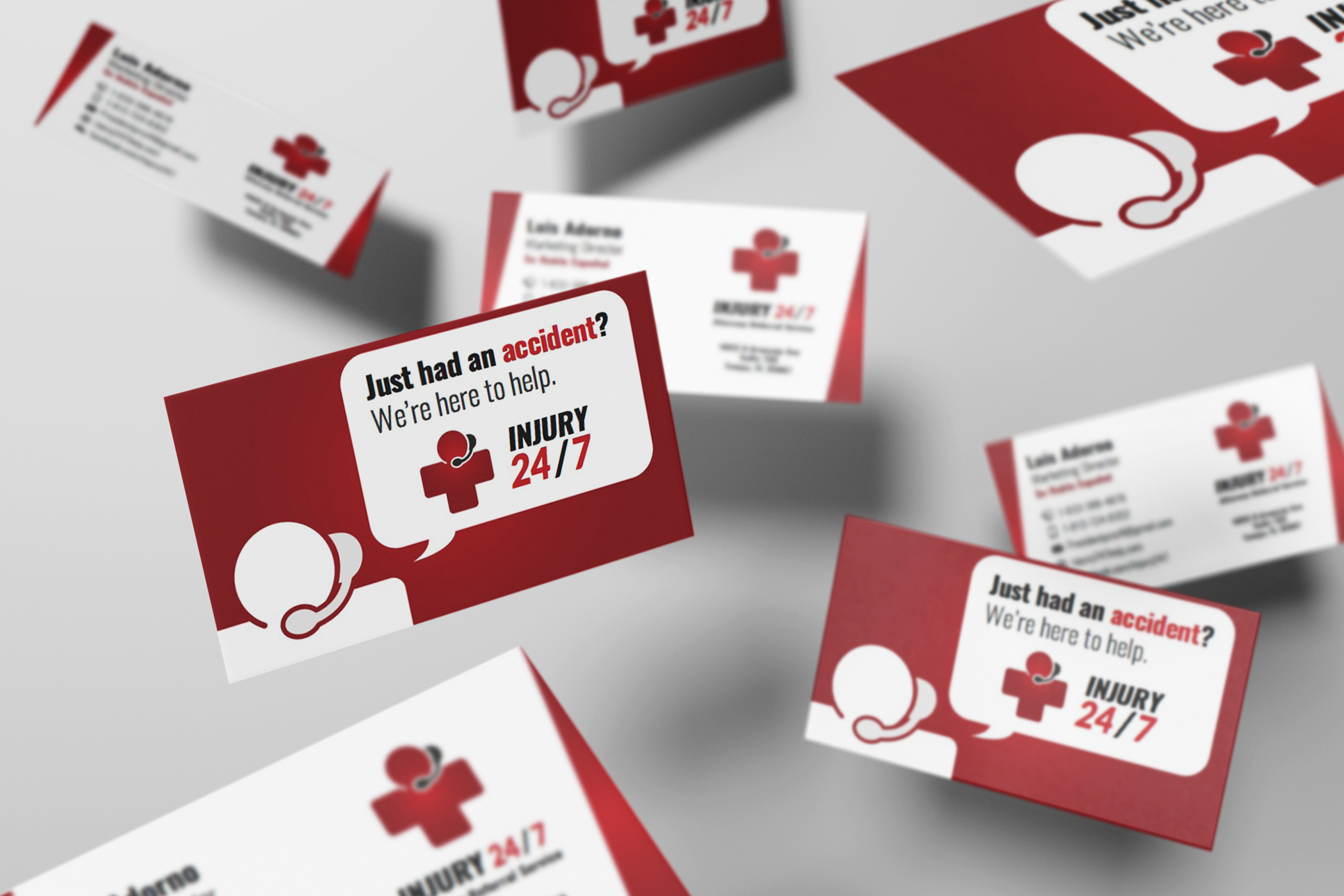
One place you should not go the DIY route is branding. Branding is the base of your business and even goes beyond visuals. One specific element of your brand is your logo. Though you may think a logo is just a symbol for your business, they do so much. Logos serve many different purposes— they reveal identity, invite new customers, distinguish from the competition, facilitate loyalty, and can tie everything together.
Because all of your other materials will be influenced by your logo, it’s smart to get it done by a professional. Companies like Expert Media Design offer affordable small business branding packages for any budget.
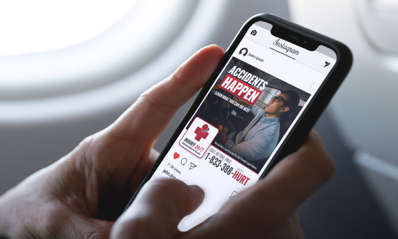
Create Hierarchy
Hierarchy can be defined as an arrangement or classification of things according to relative importance or inclusiveness. This is important in marketing because your goal is to communicate with a potential customer. In order to properly communicate, you need to draw their attention to specific information.
Think about it. Imagine a poster board where everything is the same font size, weight, and color. If you glance at the poster, the amount of information is so overwhelming that you can’t readily consume the general point of the poster. Instead of taking the time to understand the body of text, you’ll likely get bored and move on.
On the other hand, if the poster had body text along with an eye-catchingly large title, a subheading with quick supplemental text, and a call to action that’s highlighted at the bottom of the page, you’re more likely to take in the information.
This is because the layout of the text was made digestible. Humans are fast moving, quick-to-boredom creatures. Typically, you have 3-7 seconds to hook your viewer. By creating areas that are easy to skim but still receive the intended message, you’re way more likely to find success in your marketing.
Try It Yourself
Determine each piece of content’s rank. Maybe you want: #1 Logo, #2 Title of Promo, #3 Call to Action, #4 Subheading, #5 Body Text. Whatever you determine, draw focus to those items in that order.
For titles, consider using a more different font than your paragraph. You can also pick one font and use different weights (bold, semi-bold) for the title and regular weight for the rest. Another tactic you can use is color. Make your title the brightest or most eye-catching color. Shapes and highlights can also be used, like when a square is placed behind the title.
Give Elements Breathing Room
One of the biggest things a business can do to look ameature is squish their elements too close together. Everything needs a little bit of space on the page. This tip goes hand and hand with the last one—if everything is too close together, the marketing piece is too hard to scan.
Try It Yourself
Add space, also known as padding, to all four sides of a photo. Text on pieces, whether print or digital, should have margins and not run too close to the edge of the page. Look up references if you need to see how others handled spacing issues.
Add Contrast in Colors
Contrast refers to the arrangement of opposite elements. It can refer to rough vs. smooth textures, large vs. small shapes, etc. Specifically, colors can also be contrasting. The goal for everything is to be understandable and legible. Are you sensing a theme here?
If colors are two closely related, it can be hard to easily read it, especially for those who are older or have worse eyesight. Stick to colors that are clearly different from one another.
Try It Yourself
Your text should stand out against the background. If you are choosing a colored background, make sure the text color is either way darker or lighter than the background. It can also be a completely different shade, but be careful. Just because you use different colors, like red and green, doesn’t mean you have high contrast. They also need to differ in lightness or darkness to one another.
Stay Consistent
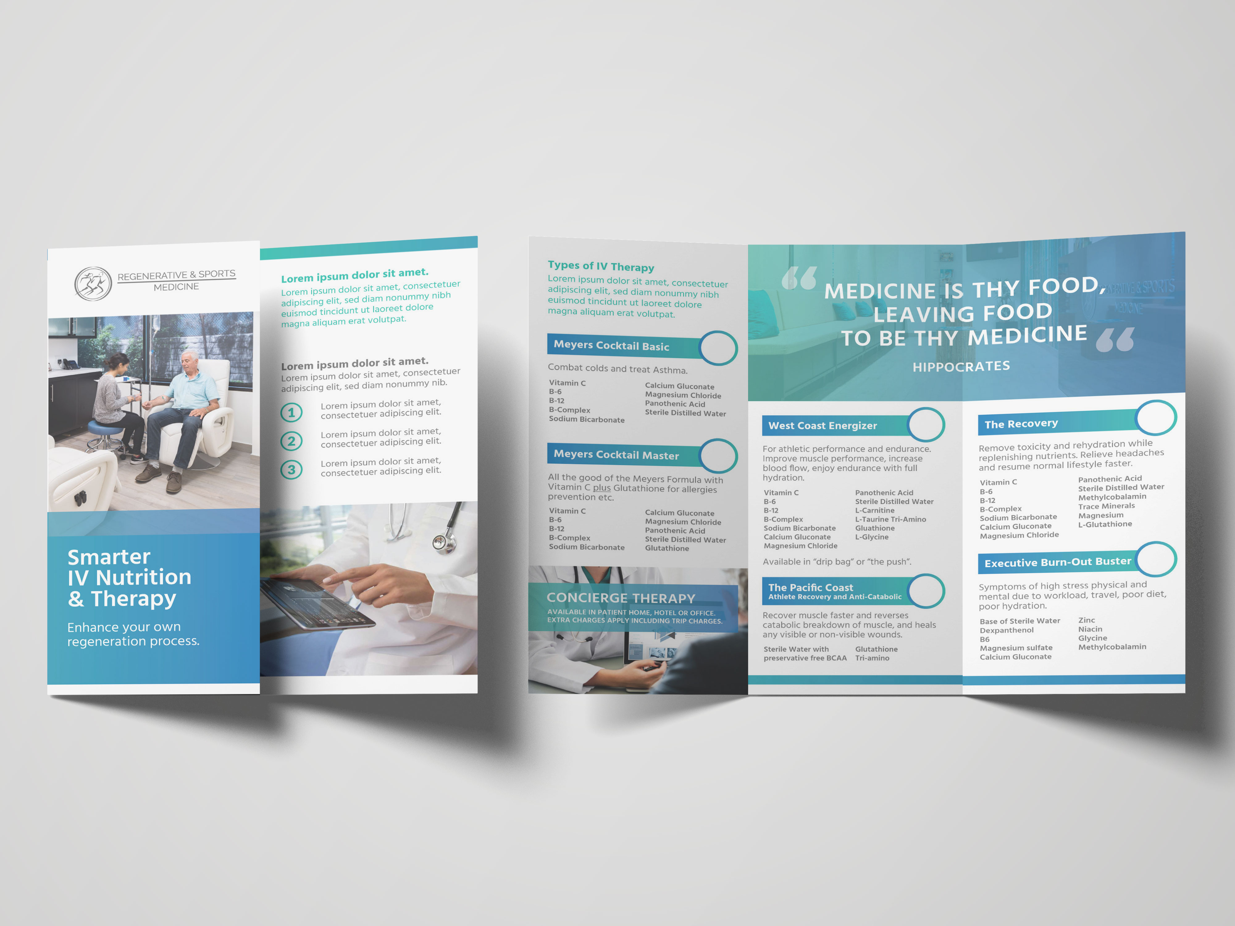
One of the best ways to look like you hired a professional is to keep your branding consistent. Don’t keep changing what your visuals look like. The mission is to make all of your marketing identifiable to your business. If you continually change what you look like, it can confuse your customers.
Your website, brochure, and mailer don’t have to look identical to each other, but they should be related. Think of it as a family. Elements might be laid out differently depending on what the material calls for, but they should all like they came from the same origin.
Try It Yourself
Pick one or two fonts that go together and use them for everything. Not sure where to start? Font Joy shows you different font pairings that work together and where you can get them from. You can also skim Google Fonts for free fonts to use.
You can also choose elements to repeat. Say you
- Always have a thin green line under your titles
- Always put your titles on top of a gray square
- Always have a border on the top of your page
- Use circles as accents in everything, even your pictures
These will all become identifiers for your business.
Pick a Signature Color
This one’s pretty easy. Speaking of staying consistent, it can help to have a signature color. Think Starbucks green or H&R Block green. Using a signature color can increase brand recognition by 80%.
Try It Yourself
Pick a color and find a way to incorporate it throughout all of your touchpoints.
Align Elements on a Page
Another simple way to make a big impact in professionalism is to line up your elements. It’s actually pretty simple. All you need to do is try to make sure the edges of items like pictures run along the same line as text. This helps everything look organized and concise. Even the simplest of things look like you took extra time and care.
Try It Yourself
If you have two columns, make sure the tops line up flush. You don’t need to actually draw out lines, but most software, like Word and Powerpoint, will tell you when you have an element lined up with another, or even have a button to do so for you.
It’s All In The Details
Why does it matter? Human beings have an attractiveness bias. People perceive beautiful things as things that function better, whether they actually do or now. This perception can give you an edge on the competition.
Even when you can’t afford design help right now, there are still ways to bridge the gap until you can. If you use these tips on diy marketing for a small business, you’ll be able to fake it until you make it. It just takes a little extra time and attention to detail.