We’ve already discussed why a brand is integral to a company’s success. A brand is a complex system with lots of moving parts, much more than just a logo. The biggest companies of today have carefully considered every touchpoint and design choice. Of course, a strong design system won’t make a bad business successful, but a good company with terrible design won’t be likely to succeed either.
Taking a look at major success stories can help smaller brands identify the path to success. This can allow a company to become introspective and dream big for themselves. Target is an international company that has become a household name. The company has worked hard to make themselves identifiable not only in the marketplace but in their clients’ minds.
Clean & Bright: Target
It’d be hard to find someone who hasn’t shopped at, seen tweets about, or watched a commercial from Target. The retailer has become a favorite in many people’s hearts. Twitter is flooded with relatable tweets about the addictiveness of the store.
How did they place themselves at the forefront of so many different shoppers, spreading across a variety of different age groups? Well, taking a look at their visuals, they kept it clean and crisp.
The Look
Allen Adamson wrote an article for Forbes in which he mentions hearing Michael Francis, the chief marketing officer of Target, speak. Francis summarizes the Target experience as the “balance between making our ‘guests’ aware of value while emphasizing superior merchandise and a pleasant shopping experience.” This goes along with their slogan of “Expect More, Pay Less”.
The Target brand want to express value, but they don’t want to seem unattainable. As a retailer open to everyday people, they don’t want to feel out of reach. Instead, they side with a clean modern edge, with some added whimsy. Target describes their own brand by saying “great design is fun, energetic, surprising and smart—and we don’t just mean how something looks. It also satisfies a need, simplifies your life, makes you feel great and is affordable to all.”
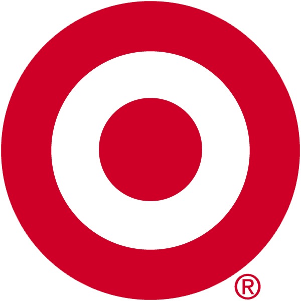
The Logo
Outside of the real life items, the rest of the advertisements rely on flat elements that express a no mess straightforwardness. Even their logo is relatively plain. Don’t let this simplicity deceive you, it’s actually Target’s strength. With such a basic logo, the company created a mechanism to inspire all its branding off of. The circular elements of the bullseye are played off of in ads, interiors, and commercials.
Applications
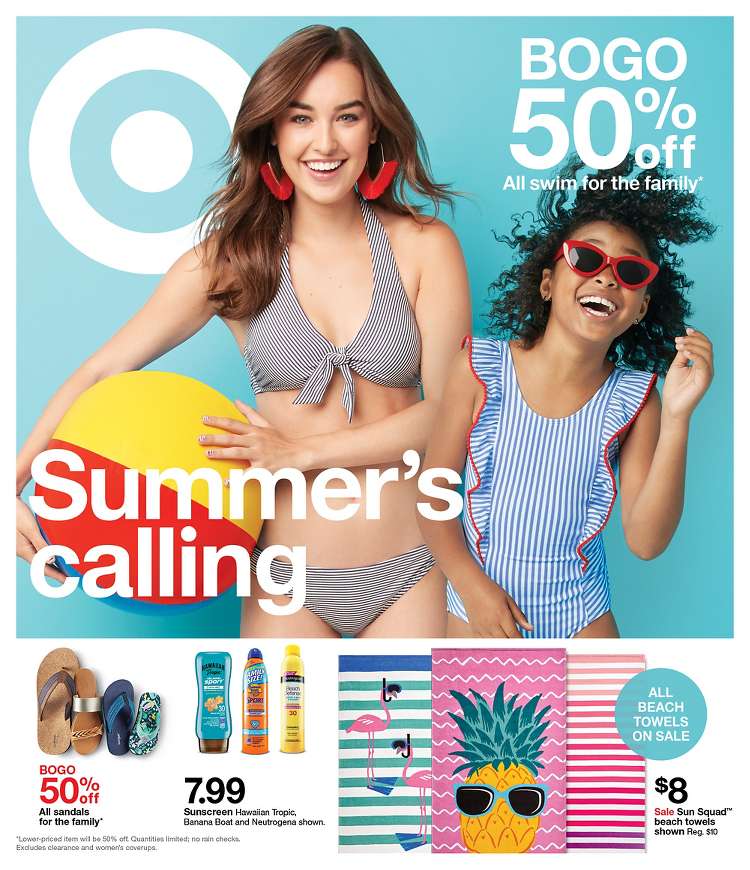
Let’s look at some advertisements. These can also be seen as posters within the stores. The striking red bullseye stands out against their often used white backgrounds. Their use of props and elements in interesting ways adds to the fun of their marketing. Another strong element is their consistency across different ads and formats. You can identify a Target advertisement right away based on the color, circular elements, and playful nature.

Think this is a relatively new idea for the brand? You might be surprised to find out this system of visuals has been in Targets history since at least 1969, as seen below.
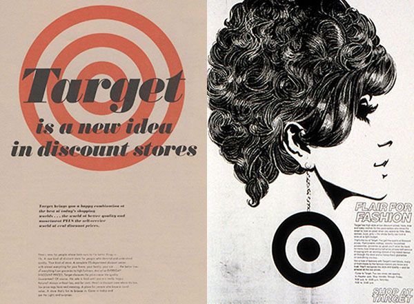
Even when they compartmentalize within departments, they keep the flat, graphic nature. They stray from their vibrant red but use of saturated colors. This youthful feel helps the visuals stay loyal to the brand.
The Touchpoints
The Interiors
Every interaction with a customer is an opportunity to further brand integration. Each touchpoint should tell an unchanging story of your company. William Arruda wrote for Forbes that “branding is the key to differentiating yourself from the competition, but if you don’t build your brand promise around reality or consistently live up to it, your branding efforts are pointless.” Therefore, each touchpoint should follow the system of the brand.
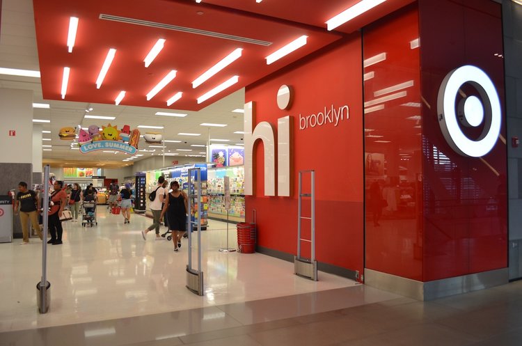
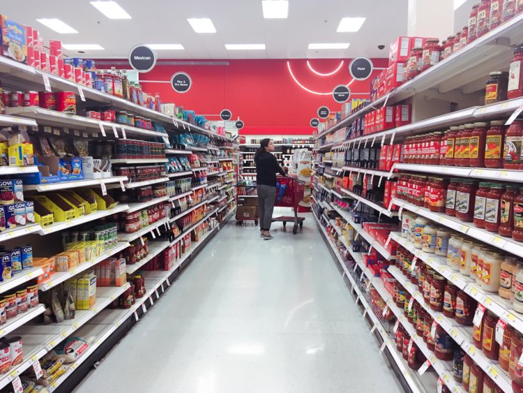
Target takes this to heart in each customer touchpoint. The interior is mostly a shade of white, matching the background it uses typically. Accent walls of red can be found throughout, as well as the bullseye used in multiple applications. Remember the importance of the circular shape from the logo? This shape can be seen as the labels for each aisle. Ignoring the small details can be a missed opportunity for businesses.
The Website
Although website design can feel entirely different from print or interior, it’s not as challenging as you may think to stay consistent across these mediums. The website, pictured below, keeps the same stark white, this time with the menu bar standing out in red. While this matches the branding, it also makes sense hierarchically. Because red draws your eye, you’re instantly pulled into the menu section. This is the best place for you to look first as a customer, as it will help you navigate the site.
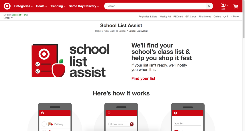
While photography is used often on their website, I pulled this page out from the rest for a specific reason. In the photography from other examples, Target manages to keep it clean and concise with the flat backgrounds and shapes. That same effect can be easily conveyed in their website graphics. Notice how the checklist and apple lack depth and realistic shadowing. Still, there is enough detail for you to understand what’s going on.
Another small detail that often goes unnoticed is typography. Target uses a sans serif font across the board. What does this mean? Sans serif is a monoweight type, meaning the strokes are all one length. This not only makes it easier to read on websites, but appears simplistic and modern as well. Notice Target’s use of lowercase letters. This specific treatment can be seen in different display applications throughout the website and the store. It stands out as different from the other type treatments, therefore creating a hierarchy for the title. Read further on sans serifs through Sitepoints article.
The Takeaways
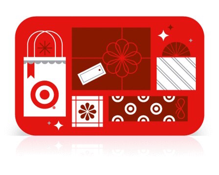
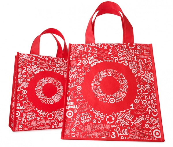
Below are Christmas gift cards and reusable shopping bags. You can see the flat graphics and color palette repeated in the cards. For the shopping bags, they use negative space to create their logo. Although this varies from some of their other examples, you can still notice the core of their brand showcased.
Social Media
In a previous article, we’ve discussed how branding goes beyond visuals. Target’s brand feels youthful and simply fresh. Its voice matches this. Just like their flat graphics, their wording is no nonsense and without fluff. They also utilize social media strategies we’ve discussed before, like holding a poll or asking a question. This gets customers involved and further invested in the brand.
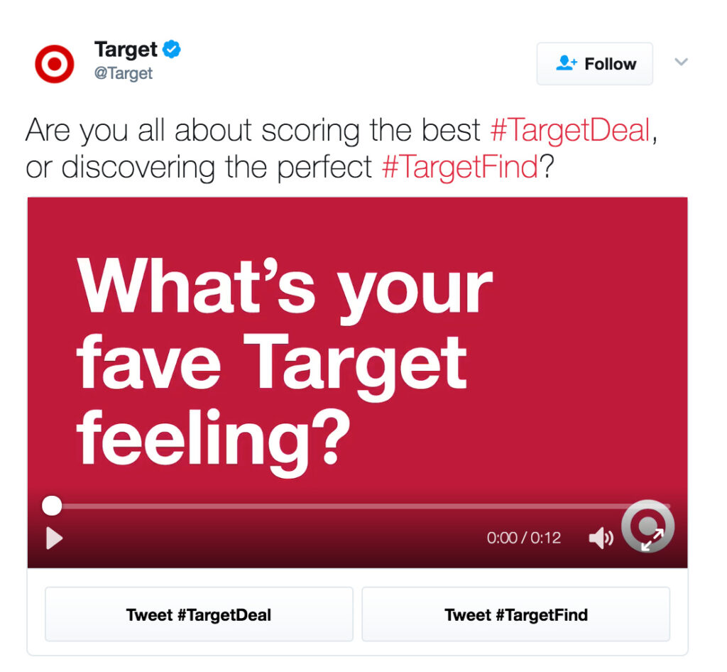
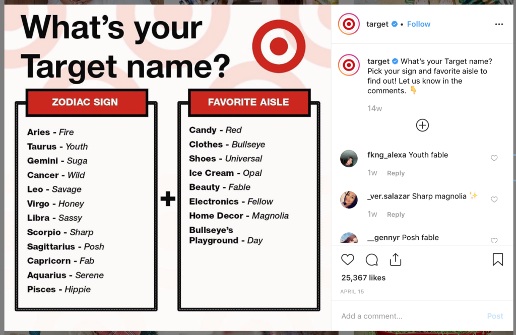
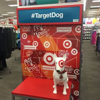
Photo Opportunities
Speaking of interaction, encouraging customers to interact with your brand in person helps them feel even more connected to your brand. Having spaces to photograph or creating an “Instagrammable moment” can be a great way to get customers to do the advertising for you. If you create something they want to post, you’re not only reaching their followers but communicating to them that someone they know uses and trusts your brand. Want to read more on these Instagrammable moments? Check out Marriott’s article.
Commercials
Target’s commercials are just another way to integrate similar visuals on a different type of media. Linked below is a target commercial. Notice the amount of detail that goes into the color choices. The car is white with red lights. The lamp is all white and the shoes are red. Even the diaper brand showcased, Huggies, has a red and white box. These may feel like minute details, but imagine if the lamp was pink and the shoes green. Against the Target branded environment, these products would feel out of place and less intentional. The varying people shown displays their inclusive audience, while the music feels upbeat and friendly.
Keep in Mind
As they say, good design goes unnoticed. If you’re doing your branding correctly, all of these elements should blend into the brand and feel natural. Your goal is for a customer to be able to see something from your business and instinctively know it’s you. They may not be able to specifically dissect each element of your brand, but that’s okay. You just need them to be able to identify your business from a crowded marketplace. As seen with Target, cohesion is key.
Is there any part of Target’s brand that you never noticed before? What are other brands you find successful? Let us know in the comments!
Need help getting your own brand in tip top shape? We’re here to help! Get a free quote for your project.