Touchpoints are commonly used in business. They can even make or break a company’s relationship with a client. So, what are the touchpoints in marketing and how should they be used?
The Purpose Of A Touchpoint
A touchpoint is any point of interaction with a customer or potential customer at any stage of the customer journey. As a customer, you’ve come in contact with them more times than you can count. Actually, they are so innate that customers often don’t even recognize them as a part of the marketing process, but rather an essential component to a product.
Touchpoints serve many purposes. They help unite a brand across all media while expressing the brand’s unique feel and personality. They help connect the big picture strategy with the details. For example, if a key attribute of your company is sustainability, choices made in printing, materials, and packaging – as well as design choices – impact how that message is portrayed to an audience.
Today consumers use an average of almost six touchpoints with nearly 50% of them using more than four regularly.
Most importantly, touchpoints are how your business interacts with customers. Think of your company as a tree and the fruits are your product. The touchpoints represent the branches that reach toward your customer, delivering the fruit. This is why it’s imperative to pay attention to the details when developing marketing touchpoints. Because they serve as communication for your brand, they must appear cohesive with the design elements used within your brand. If your touchpoints don’t match your brand, customer’s won’t be able to identify your company.
What Are Touchpoints In Marketing Examples?
With touchpoints and their purpose defined, let’s dive deep into examples that can be utilized.

A Website
With the growing use of technology, websites are a necessity. Not only that, but the need for responsive web design is no longer up for discussion. In 2018, mobile ecommerce revenue accounted for 50% of total U.S. e-commerce revenue. Websites are a super effective way to communicate with your audience.
Sometimes, a website is the first place a consumer comes in contact with your business. Make sure the first impression is the right one. When designing a website, it’s important to keep site goals, audience needs, brand personality, and key messages at the forefront. Functionality is important, but don’t overlook the visuals of your website. A study found that first impressions are 94% design-related.
75% of consumers admit to making judgements on a company’s credibility based on the company’s website design
Users expect certain things, like the menu to be readable and at the top of the page. A customer has come to your site for a reason, whether it’s for contact information, browsing your product, or looking for pricing information. If they click on to your site and can’t find the information they need quickly, they are likely to leave without conducting an in depth search. Make sure your navigation is clear and concise.
Want to make sure you’re avoiding all of the most common website mistakes? Check out our article on how your website could be costing you money.
Favicons
Favicons are a component of the website that is often underappreciated. People typically don’t even know the correct name for them. Favicons are the little icons that show up next to the URL when searching for a website. The blue bird by Twitter.com, the grey apple by Apple.com, or the bullseye by Target.com are examples that you’ve probably seen. While not essential to web development, it’s an easy way to add another element of your brand. Here’s a tutorial on how to add them.
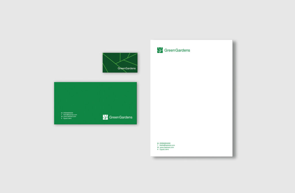
B.L.E. system by Baianat
Correspondence
Correspondence literally means a connection, so it’s no wonder it made the list of important touchpoints. When we talk about correspondence, we’re referring to a B.L.E., or a business card, letterhead, and envelope. While your whole brand should be a united system, B.L.E.s are especially connected visually and typically the most formal of your touchpoints. They should use similar paper, type treatment, color, and organization.
When choosing designs, make sure the content is readable and easy to find. Bold, avant garde design is great, but if the information is illegible, it renders the letterhead or business card useless. Keep how you display the contact information consistent between the items. It’s okay if one uses more information than the other, but keep abbreviations, typecase, and labels the same.

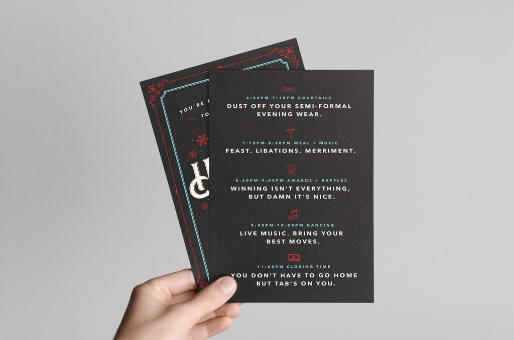
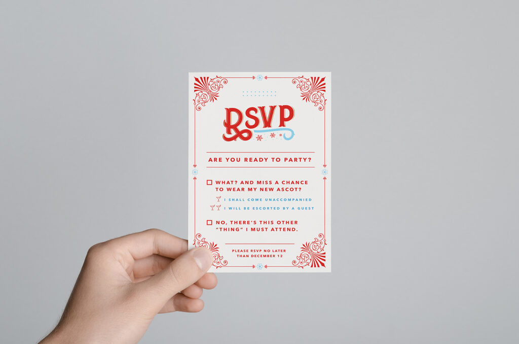
Sandbox Holiday Party Invitations By Paul Burkhart
Print Materials
Print materials involve a variety of items like brochures, annual reports, catalogs, event invitations, one-pagers, posters, and others. Their purpose is normally to help customers make informed buying decisions. Because of this, they should contain to the point information that aids the consumer in understanding your company’s and product’s purpose.
Again, your branding system comes into play here. Sensing a trend? For these pieces, focus on the same typefaces used on your website and wordmark, stick mainly with the determined color palette, treat headings and type similarly, showcase the same contact information from the B.L.E., and keep your brand’s personality throughout. Target does a great job of staying consistent yet fresh, check out our article about them for examples.
You may be thinking that keeping the same design system throughout your company is redundant. Won’t people get bored? Besides making your business more recognizable, repeating similar design styles actually makes customers prefer you over a competitor. How does this work? According to the mere-exposure effect, people prefer things that they are most familiar with, so by making all of your touchpoints feel similar you’re creating positive positioning within their mind.
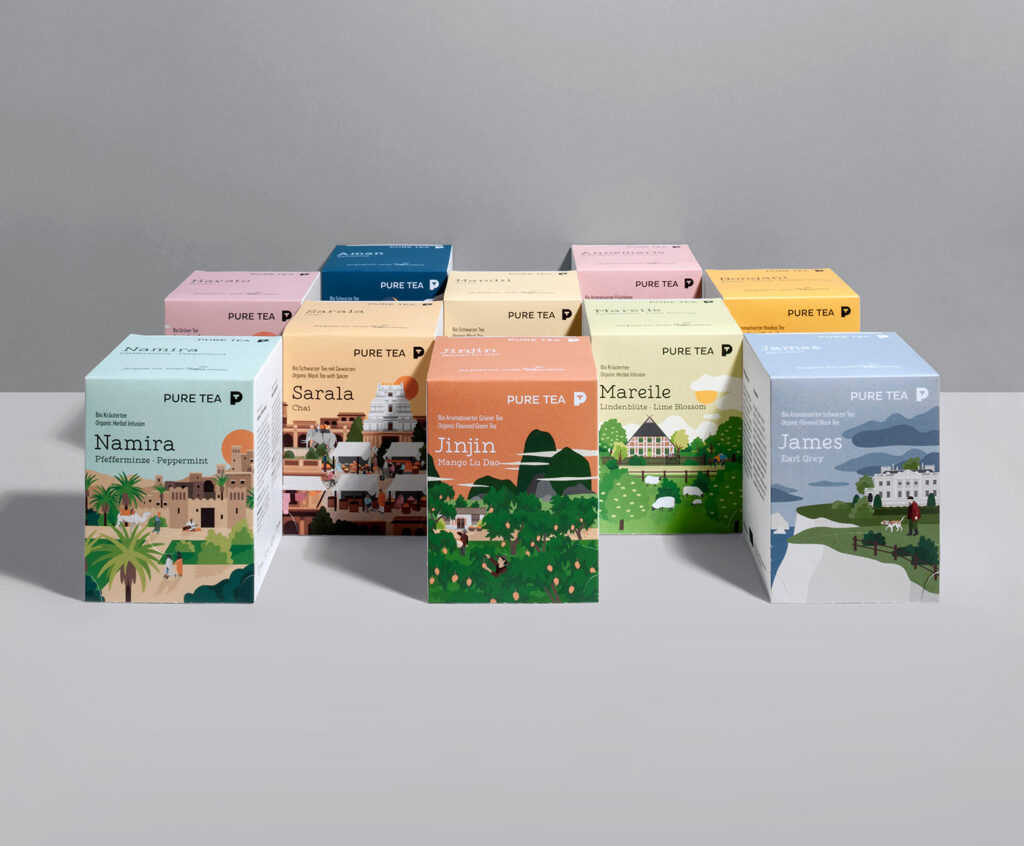
Pure Tea By Philipp Zurmöhle and Heine Warnecke Design
Packaging
If you have a physical product, packaging is another way to interact with a customer. Procter & Gamble Co. determined when a customer shops, they typically make their decision within 3-7 seconds. That means all of your labels, marketing, and design effort needs to use that small window to appeal to what drives our customers to purchase. Having good design helps your product sell and gives you an advantage over others.
72% of American consumers say their purchasing decision is influenced by the packaging design.
To start, conduct research. Who is your target audience? What does your competitor’s packaging look like? Which physical structure works best for your product and your audience? How can you stand out while still fitting into your brand? These are all things to consider.
Advertising
Advertisements fit into various different formats like social media, radio/podcasts, and video. Even with the rise of technology and social media, print advertisements still have a place in the industry. While advertising is still influenced by the brand’s system, it needs to break the mold a little bit more. This is because advertising requires an extra layer–a story.
All brands have a mission as well as a personality, but an advertisement has an underlying strategy apart from the brand’s strategy. The campaign needs to grab people’s attention with a big idea before they turn the page or walk past. Whether this is an emotional narrative, a funny anecdote, or a demonstration of the product, an ad needs to convey specific information to an audience.
Environments
What are your brand’s attributes? Are they modern and expensive, down-to-earth and warm, or relatable and quirky? There’s quite a variety of attributes your company can fit into, each with its own personality. How does an environment help figuring out what are the touchpoints in marketing?
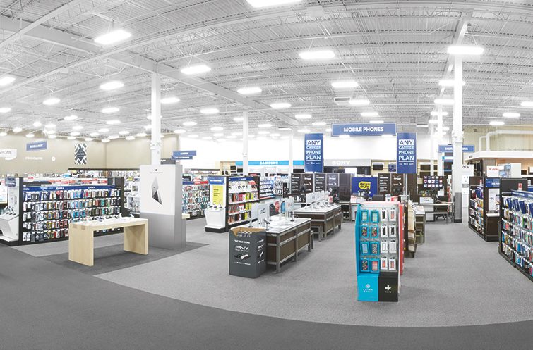
Think of how different you feel when you step into an Apple store vs. a Best Buy store. Each company has its own nature, and the storefront reflects that. From the checkout counter to the paint color to the displays, each decision contributes to the overall vision of how you are being marketed to a customer.
There are multiple factors to consider. What are you employees wearing? Are they casual or dressy? Do they have a uniform or just a name tag? What does your signage look like? Is it a sticker treatment on a window, a fixture on the building, a stand alone sign? Do you use a vehicle in your business? Do they have a wrap on them? Are they a certain color? What are their distinguishing features?
Find Success
There is no perfect guide for touchpoints, necessarily. It all depends on what you want your brand to convey. Think about what’s best for your business and figure out what are the touchpoints in marketing you want to utilize. Stay consistent in your system and pay attention to the details. In time, touchpoints are a sure way to improve your business.

