Businesses and industries change all the time, even in the automotive industry. Eventually, this change brings the need for rebranding. Rebranding refers to changing the public image of a company. The industry recently saw a big shakeup when three of the biggest names in the business – BMW, Nissan, and Volkswagen – adopted a more minimalist logo design. Here’s why they did it – and why you need to consider doing it too.
Why Do Companies Rebrand In the First Place?
The branding of a company is the core identity of that company. There’s more to a brand than just the name of a business; it fuses together all the core ideals, standards, values, and characteristics an organization represents. Think of it as being like the personality of your company.
There comes a time when even beloved and respected brands have to reassess their personality, which leads to a rebrand. Companies change their branding for all kinds of reasons, such as changing times or messaging updates.
Sometimes a rebrand is necessary because of more complex reasons, such as a shift in social dynamics and the way specific images are perceived. This is less common in an industry like the automotive one, but it can happen.
The top five reasons brands change are:
- The launch of a new product or service
- A lack of customer engagement
- Bad reputation
- Differentiation
- Lack of clarity and consistency
The Trend Towards Minimalism

Installation view, “John McLaughlin Paintings: Total Abstraction”
Another major reason for rebranding is that trends change all the time. The current trend these days is a shift towards minimalist logo design. The minimalist logo has been becoming more popular in recent years but has really exploded lately. The movement towards minimalism began in the early 2000s, but it borrows from previous movements in fine art and human-computer interactions. Minimalism can be considered a way to prioritize content over chrome.
While minimalism can work wonders, many minimalist logo ideas don’t fully understand the concept. Some people see it as just a visual-design strategy and take out essential elements in their pursuit of minimalism. The purpose of a minimalist logo design is to offer context and content directly while avoiding distraction from the core message.
Minimalism can be considered a response to bloated maximalist designs. There came the point where people were suffering from information overload because branding was too heavy. It was time to remove the fluff and focus on the primary idea — this is the principle behind rebranding with minimalism in mind.
Minimalist proponents say that the movement reduces information overload. The less content and features there are, the fewer things people have to process. Minimalism has also been shown to create positive emotional experiences. If you avoid cutting out too much information or creating information underload, a minimalist logo is a great idea.
Exploring the New Minimalist Logos of Automotive Companies
BMW
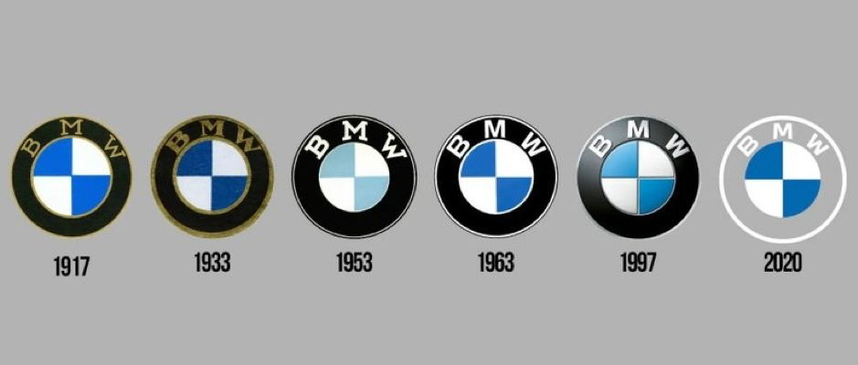
A timeline of BMW Logos; Courtesy of www.autonews.com
As you can see from the comparison above, it has been 23 years since BMW last updated their logo. The new update is designed for offline and online communication purposes, according to BMW, who say that it is better suited for the digital age.
The main change in the rebrand is the outer ring has gone from being solid black to transparent. The design is also flatter and more straightforward than the previous logo, which had a 3D feel to it. BMW also says that the new logo stands for the openness and clarity they strive to have as a relationship brand. The brand says they are equipping themselves for the various points of communication – offline and online – that BMW will appear now and in the future.
Nissan
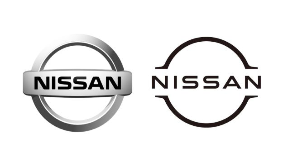
The previous (left) and new (right) Nissan logo, courtesy of www.creativebloq.com
Nissan has also adopted a minimalist logo design for their new logo. Not only have they replaced the chrome badge with a monochromatic version, but the font for the word “Nissan” is straighter and cleaner.
Nissan explained the change by saying that it has been working on the logo rebrand since 2017. The team was inspired by three words – “thin, light, and flexible.” The design started in 3D before shifting to 2D, transitioning from a hard-edged industrial look to a refined digital-friendly one.
Volkswagen
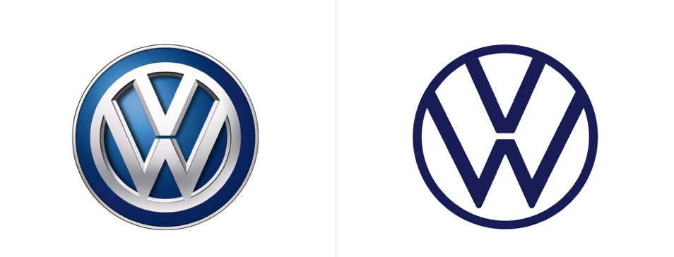
New Volkswagen logo, courtesy of www.underconsideration.com
Volkswagen is one of the biggest and most influential car companies in the world. The company has existed since the 1930s and has something of a checkered past, given that it was the car of choice for Nazi Germany. The company has also been involved with several controversies, including emissions fraud. Volkswagen has also created some of the most popular cars in the world, such as the iconic Beetle and Golf.
The new logo for the company is a sign of their change for the better. It uses the classic symbol as the base but is more modern and straightforward than before. The logo has been reduced down to the essential elements, represented with a simple 2D design. The logo has always been blue and white, but the new version has a new blue tone for different color variants. The new logo brings the company forward to the digital world and is a sign of its dedication to moving on from the mistakes of the past.
Is Rebranding During COVID-19 Even Smart?

The idea of rebranding during a global pandemic seems strange. Now hardly feels like the right time to make such a change, but the reality is that companies continue to alter their branding even now. All three of the changes discussed above are recent – with the shift happening mainly during the pandemic.
The truth is that you must always think about where your business is going and where you want it to be. There has been plenty of disruption to companies caused by the pandemic, and everyone wants to get back to “normal,” but no one knows when that is. There are some things we do know, though:
- Companies that make temporary changes because of the pandemic may see those changes become permanent
- Customer behavior is sure to change because of the pandemic
Even though it’s a unique time, it could potentially be the best time to rebrand and adopt minimalist logo ideas. Take stock in your company and determine what changes will be effective for you. No matter what, you’ll need to be actively responding to what is happening in the world.
By preparing now, you can get a head start on the competition and show customers that you are better, faster, and more adaptable than your competition. Look back at similar world crises, such as the 2008 recession, and learn from businesses that thrived in that situation.
Take some time to look closer at your business, contemplate minimalist logo ideas, and consider rebranding for the “new normal”, whatever it may be.