Your business has a functional website with all of the necessary information on it. Good enough right? Actually, not paying attention to the website’s design can cost your website ROI. Often times companies don’t even realize the costly mistakes they’re making. Let’s walk through some of the most common pitfalls.
Design Elements That Distract
Seemingly aesthetic choices can have a negative effect on site usability, which in turn can lead to loss of sales. Usability should be one of the priorities, but ignoring design can be fatal and cost the website ROI. As many as 38% of people will stop engaging with a website if the content or layout is unattractive.

Something as simple as text color can also have an impact. When considering the look of your site, contrast is key. Your text should stand out against the background, making it easier for viewers to read. Avoid colors that blend together, like a bright blue text on a vibrant red background.
Sizing is another element to keep in mind. If a logo, graphic, or picture is oversized or does not properly fit the page, it may force the viewer to scroll a significant amount. Praxent found that improper sizing can take away from the user’s experience and bury important content. In worse case scenarios, users will even give up one their search efforts.
An interesting study dives into eye tracking. The Nielsen Norman Group found that most people read in an “F” shape, focusing on the left side of the page. The study shows that not only do people look at the left side first, but they focus on that side for 69% of the time they are viewing. Because of this, it makes sense to have important elements like further navigation or headings on the left.
Speaking of eye tracking, an additional variable to consider is photography. When a photo depicts a person looking in a specific direction, the viewer’s eyes will automatically follow. Use this to your advantage by placing an image so that the subject is facing a piece of content you’d like to highlight. That way the viewer will follow the eyes straight to important information.
Keeping your website fresh with updated content is a great way to get repeat visitors. Over time, you position yourself as a credible resource in the client’s head. While continually adding content is necessary, changing your website’s overall design is not. Elements can be updated to fit your changing needs, but too many visual changes too often makes it hard to identify your company’s look. Also, changes in key features, like the main navigation, puts viewers on edge. Consistency is essential, as it builds recognition and adds a sense of stability.

Ignoring Mobile Design
According to Praxent, mobile phone users are expected to pass five billion by 2019. That’s way too many people for you to ignore how your website looks on mobile. You may be thinking, can’t they just view the desktop version on their phone?
By not adapting design elements, text formatting, and pictures to screen size, you’re making it harder on mobile users to read and navigate your site. Buttons may become too small to push, causing the loss of an interested customer and perhaps even the loss of a sale. Users make their decisions quickly; we’ve discussed previously how we only have 3-7 seconds to persuade them.
Another reason to have a mobile friendly site? Junto found that as of 2015, more searches are done on mobile than on desktop. They also found that if you’re a local business, you are also 61% more likely to be contacted if you have a mobile friendly site.

Long Loading Time
In the age of instant gratification, people have very little patience online. It is imperative to keep loading times fast, as slow speeds can cost your website ROI. Bounce rates increase by 50% if your website takes 2 seconds extra to load. Conversion rates fall by 12% for every extra second that it takes your website to load.
How do you combat this? Mox gives some great tips. Some of these include reducing redirects, optimizing your website’s code, improving server response time, using a content distribution network, and making sure your photos are in the correct format. For images, use pngs for graphics with minimal colors but stick to jpegs for photographs. Make sure they are not larger than necessary.
Poor Navigation
Let’s say you’ve gotten a customer to visit your site, which can be a feat in itself. That means the customer will purchase from or reach out to your business, right? Well, your navigation may play a huge role in whether they do or not.
A customer has come to your site for a reason, whether it’s for contact information, browsing your product, or looking for pricing information. If they click on to your site and can’t find the information they need quickly, they are likely to leave without conducting an in depth search. Have your menu clearly visible at the top of your website, so it’s the first thing a customer sees.
Although you want information to be accessible, that doesn’t mean you should list every page you have on the main menu. Too many options can be just as confusing. Create a logical pathway for them to follow. You don’t have to list every service in your heading menu but do make sure its in a place that makes sense, like a tab named “Services”. Items listed on your menu should be clear and concise.
While you want your website to be unique, there are situations when you shouldn’t try to reinvent the wheel. One example of this is menu positioning. People look at the top of the page first, so the menu should be located here. Any where else can cause confusion for the viewer. We recommend having a visible menu as opposed to a hamburger style menu. The Nielsen Norman Group found that on a desktop, people used the hidden menus in only 27% of the cases, while they used visible or combo navigation almost twice as much: in 48% and 50% of the cases, respectively.
Lack Of Direction
Another pitfall to avoid is lack of direction. The site should guide users and tell them what to do. If the process of finding information or asking a question is straight forward, a viewer is likely to see it through. If there’s an ounce of ambiguity, they may give up. Make the next step obvious in order to avoid discouraging customers.
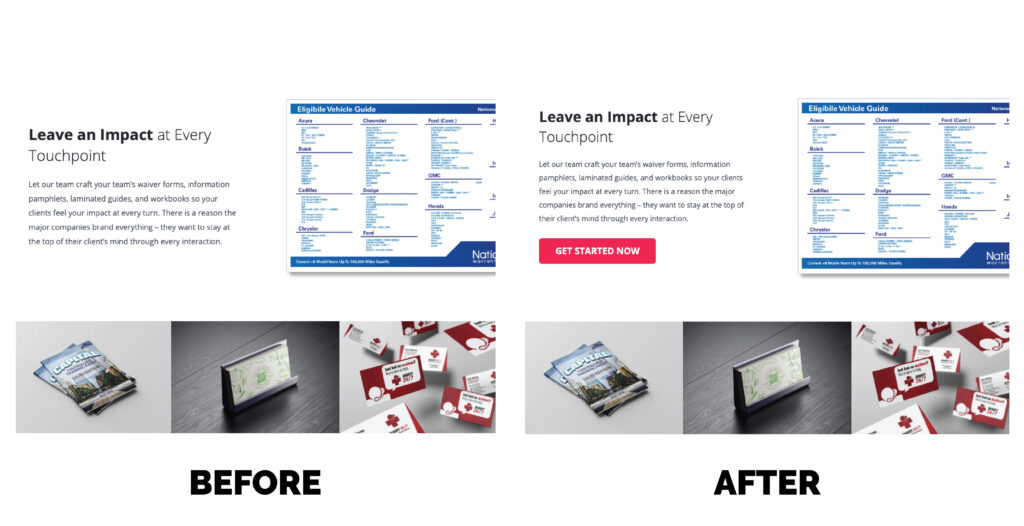
One way to implement this is by having clear call to actions. By simply implementing your call to action, you can raise conversions by 62%. What is a call to action? It is simply directing the viewer to take specific steps to complete a task. For example, this could include filling out a contact form, signing up for a mailing list, following social media accounts, or learning more on a subject.
Continuing on this topic, an absence of a description in relation to a contact page can cause confusion. A site should not only display a variety of ways to be contacted but also include insight on specific channels. Email may be best for a proposal or cost estimate while a phone call or social media message may be ideal for a quick question. Pay attention to this, because 51% of people think “thorough contact information” is the most important element missing from many company websites.

Overlooked Customer “Wants”
The website includes easy navigation, accessible contact information, pricing options, and an About Us section. What more could a customer want? Well, if your site ends there, you may be costing your website ROI and missing sales.
Viewers like to know what they’re getting themselves into. They want to understand what your company does and what that looks like. Having company created content is integral, because 47% of consumers view 3-5 pieces of content before talking to that company. This could be a portfolio page, photos of current products, or access to blog postings.
You’ve probably heard word of mouth is one of the most reliable forms of marketing. This holds true on websites, even though the assessment is most likely coming from a stranger. In fact, 88% of consumers trust online reviews as much as personal recommendations. Make sure to showcase testimonials somewhere on your website, as 72% say positive reviews and testimonials make them trust a business more.
Why It Matters
Design is a tool used to communicate. It is often mistaken for the cherry on top when it is really the recipe that organizes all the ingredients. Every choice made on a navigational button, text color, or image within a website expresses something to a viewer. Make sure it’s saying what you want it to.
Think You Could Have A Higher Website ROI?
Don’t waste anymore time. Use our free website analysis tool to find out where your business stands. We’ll send you a website analysis report. Not happy with the results? Expert Media Design is here to help determine the next steps.