Most people turn to the internet whenever they want answers or to buy something. Having a website for your business is so vital because 88% of people research products online before making a purchase, even if they then make the purchase physically. The number of people shopping online has increased in the wake of the COVID-19 pandemic, which only makes having a website that much more important.
While it’s good to have a website, it’s even better to have an effective website that works well. People don’t have the patience to sit around and wait for a website to load. They need instant gratification. Here are some small changes you can make that add up to a big difference for your business website.
Utilize Appropriate Image Sizes
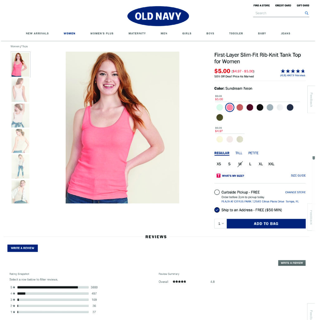
Every website needs images, and they are a key aspect of website design. Using images allows you to showcase what your products or services look like and do. Images also help to break up large chunks of text.
The problem is that not all images are created equal. You must make sure that any image used on your website is of an appropriate size. Not only should they only take up a reasonable amount of space on the screen, but they should also be optimized to have as small a file size as possible while still maintaining quality so they load faster. Another thing to keep in mind is that web images only require a resolution of 72 PPI, so going over that can be a waste. Having to load too many images can really bring down the load speed of a website, so think about image size when adding pictures and videos to your website.
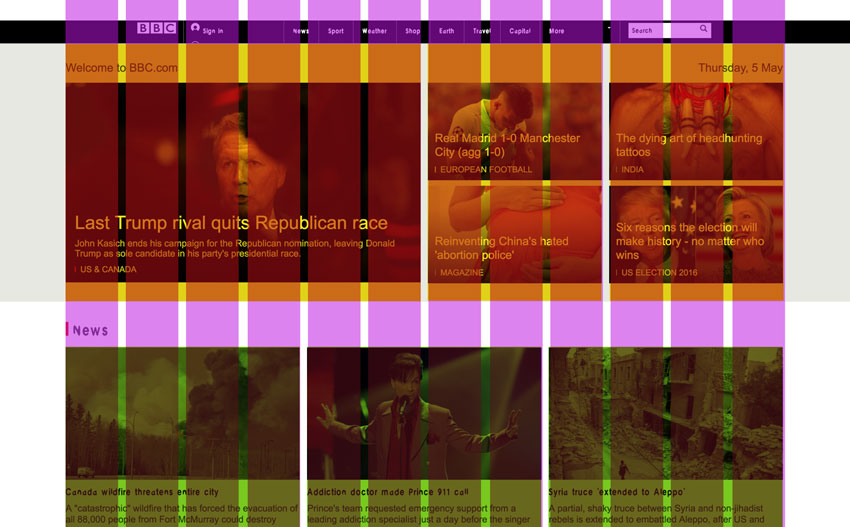
Grid Organization For Your Site
How a website is organized can make a big difference. In the old days, website builders would follow a grid pattern. Most modern websites keep to this kind of grid organization. Having a grid organization for a website improves the overall look and feel of a website, makes content easier to find, and ensures a consistent design for the website as a whole.
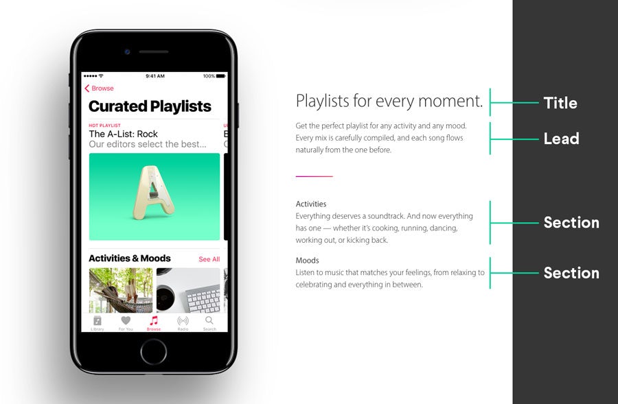
Increase Readability
It can be difficult to write engaging content to keep people reading. The average attention span is just 8 seconds. Most people scan through content rather than read it word for word. You need to make your website – and the content therein – presentable and readable for those people. Readability is one of the core factors of having a beautiful web design that attracts customers.
The easiest way to boost readability is to emphasize the hierarchy of text on the website. Use clear and defined headings with different text sizes when structuring content. Don’t be afraid to italicize and bold certain text to make it stand out more. Use these headings consistently throughout your site.
The point is to, well, make your point. Keep things simple and concise and avoid using large chunks of text. People have a hard time reading huge paragraphs. Even skimming through a wall of text proves difficult. That’s why you want to keep your paragraphs short and sweet.
Another quick point on the subject of readability is the use of hyperlinks. Hyperlinks are an essential part of a website. You want to have plenty of internal and external hyperlinks on your site. This is especially essential when using statistics. With that said, hyperlinks need to stand out from the rest of the text. It should be obvious to a reader when text is a hyperlink.
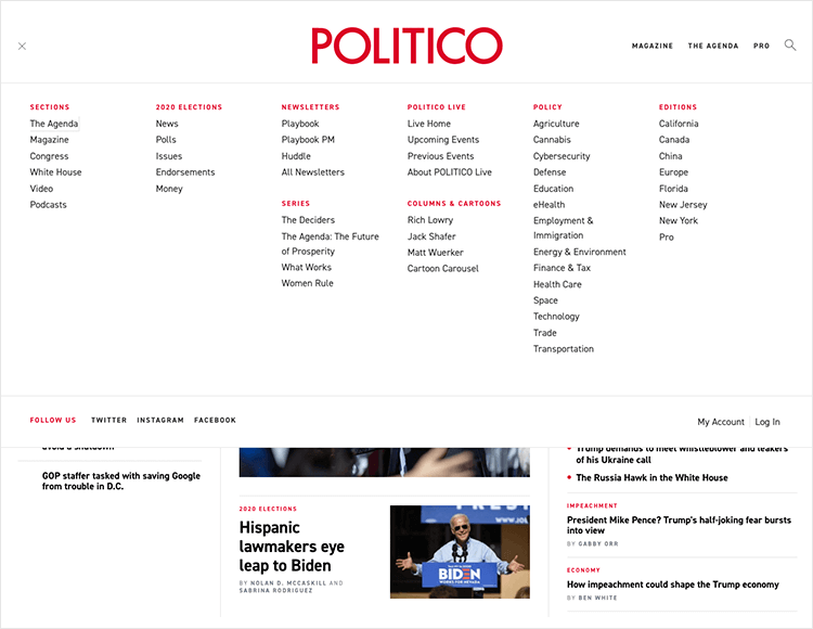
Employ Concise Navigation
Website navigation is vital because visitors need to be able to find your blog, product page, contact page, and other important pages. Make sure that your website has a concise navigational menu to the top of the page. Avoid using any lingo or terminology with the navigation menu. Not everyone will know what you mean. Avoid abstract language and, like with most things, keep it simple.
The golden rule of concise navigation is that someone should be able to get to the page they want within just three clicks. People like to navigate all over the place and will take different steps to where they want to be. Don’t forget to encourage people to explore the website more and stay on there for longer. Use links and offers to pique their curiosity and get them to stick around.
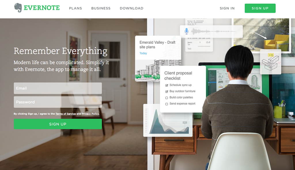
Use Call to Action Buttons
It’s not good to be pushy with website visitors, but at the same time, you can’t expect them to take action by themselves. They might not know how they should access your products and services. Including call to action buttons tells your visitors just how they can take advantage of what you’re offering them.
A call to action isn’t limited to just making a sale either. These buttons can be used to encourage readers to leave comments and follow you on social media, among other things. As you put together pages and create content, think about the action you want readers to take when they finish. Include a call to action that pushes them towards taking that action.
Showcase Testimonials Throughout Your Site
Many websites have a testimonial page, but let’s be honest and admit that no one is going to read those pages. When did you last visit a testimonial page yourself? It’s great that your clients love you and give you glowing feedback. That feedback should be seen by others. That’s why you should scatter the testimonials across the site instead of confining them to a single page.
People aren’t likely to care to read through a page all about praising your business. Find interesting ways to spread the good word about your business across the website. Include testimonials on services pages and product descriptions, for example.
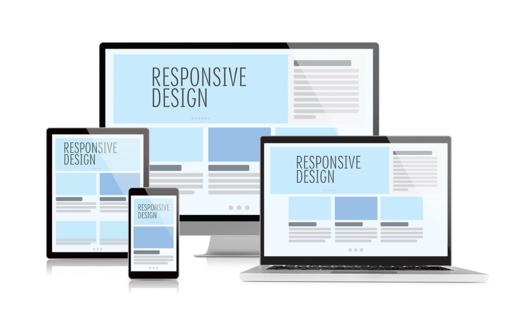
Have a Responsive Design
More people are using mobile devices to access the internet. If your website doesn’t respond well on mobile devices, you’re missing out. There’s no getting around this simple fact. Being mobile-friendly basically means that the website adjusts to the size of the screen it is being displayed on.
Some people have separate mobile versions of websites, while others choose to build the functionality directly into their website. Having a responsive website is considered better than having a separate mobile website.
Don’t Be Afraid of White/Empty Space
The empty space on a website is known as “white space”. While some people recommend you have as little white space as possible, don’t forget that you want to create a website that is nice and simple to keep readers engaged. Having too many elements on the websites, such as images, shapes, and colors, makes a website look too busy. Stuffing your website like this makes readers uncomfortable and turns them off.
Don’t shy away from having white space on your website. Rather, gain an understanding of white space and how to best use it. Crazy Egg suggests that white space on a website can actually increase reader attention by up to 20%. White space makes a website more readable and contributes to the overall idea that less is more.
Final Thoughts
With more people turning to the internet right now, there’s never been a better time to give your website an overhaul. Keep these tips in mind and consider hiring an expert service to make your business website the best it can be.