There are currently almost 2 billion websites on the internet – with about 500,000 new websites created every day. Of all of these only about 200 million are active and receive traffic, which means most websites that are created every day fail.
And the reason is simple: most don’t take their website design and function seriously.
Understanding How People Work
When you browse around the internet, how long do you think you stay on a page before you leave? Have you ever clicked on a link but because the page loaded too slowly you decided to try another site? The average user gives a website less than 8 seconds before they decide to move on. In those 8 seconds a user does 2 major things:
Typically if a visitor isn’t satisfied in either of these criteria they will leave your website before those 8 seconds are up. So yes, first impressions matter, but it’s more than that. If you’re a business owner, you want to encourage visitors to take the next step: buy or contact. If your customer leaves within 8 seconds, then it doesn’t matter if you are offering more than your competitors – your visitors will never see it.
Making it Through the First 8 Seconds
When considering how people think and navigate websites, there’s a few major elements you can focus your web development on to pass the average consumer’s initial test of your website.
Familiarity
We are pattern-focused creatures – this is why we make habits out of simple things like where we sit in a room or how we take our morning coffee. Our brains are hardwired to look for familiar patterns and find the path of least resistance. If we encounter something we are unfamiliar with, doubt and critical thinking surface. For website design this means we can build trust quickly by using familiar elements – keeping navigation menus in an expected area, keeping consistent design throughout the website, etc.
Visual Stimuli
Did you know between 65% and 80% of people are visual learners? Half of the human brain is directly or indirectly devoted to processing visual information – which is why a sales pitch with visual aids is 43% more persuasive. Having a powerful visual to immediately greet your customer will make or break your first impression.
Clarity
According to Hubspot, the most important factor in the design of a website is helping your visitors find what they want. Users typically want a few key things: knowledge of where they are on the site, a way to go back or Home, and contact information. If your website is visually impressive but difficult to navigate, your users will most likely take the easiest path – and simply hit the back button on their browser.
Loading Speed
More than just human perception – Google stated years ago that your website loading speed affects your search engine ranking. Milliseconds in load time can actually impact how long a user will stay on the internet. However, most developers need to balance the other elements we discussed here as well – a visually interactive website will load slower than than a plain text website. The slower load times might be worth the experience.
Neuromarketing to Close the Deal
After those first 8 seconds, you’ve engaged the visitor successfully. Every good salesperson knows after the greeting your mind needs to always be on closing the sale: for a website this means either having the visitor purchase a product/service or contact you for more information. Everything element of the website should be designed to persuade the visitor into taking the next step to the sale.
Here we will explore practical design elements that utilize human bias and psychological triggers that can help us influence website users and help convert visitors into customers.
Reviews, Testimonials, and Social Proof
Herd mentality drives much of our decision-making process: if we see other people try or recommend something, we are much more likely to do adopt the same behavior. There are plenty of ways marketers can use social proof to create a sense of security and quality for your brand:
- Badging and testimonials from authority figures (like the BBB, etc.)
- Reviews from established review sources (Yelp, Google, etc.)
- Written or video testimonials about brand, products, or services
- Videos showcasing how easy it is to use your product or service
- Social network support to see personalized local recommendations
- Easily accessible customer service & followup support
New ideas are emerging everyday on how to utilize social proof. For example, influencer marketing (social media minor celebrities endorsing your brand) allows a brand to create product usage videos from an authority figure in their target market.

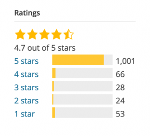
Want to Raise Your Rating?
We make it as easy as possible for your existing customers to give you more positive reviews. Not only that, our system can place these same happy customers on a text messaging marketing list for you to message up to 4 times a month.
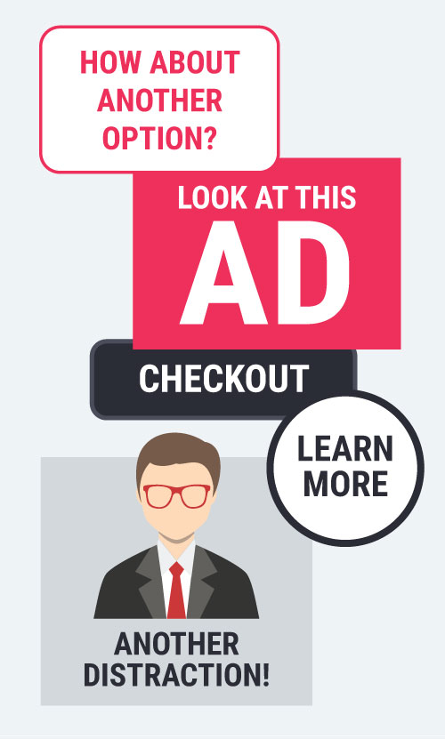
Provide Limited Choices (Especially During Checkout)
Choice abundance refers to how a cluster of options usually causes people to make decisions more slowly or not at all. Often marketers might think if they offer 50 options of their product the customer would be able to pick out exactly what they want. According to a number of psychological studies the effect is reversed: at a certain point as a variety of options increase, sales volume and customer satisfaction decreases. People prefer a direct path in decision making – simply help them understand the next step in the process. Some practical examples for any website:
- Provide one clear and actionable Call to Action.
- If you’re goal is visitor contacts, avoid too many offers and confusing messages.
- If you’re selling products online, instead of offering 30 payment options during checkout simply provide 1 or 2 famous options and a show more button for additional options.
The Fear of Missing Out
Marketers have been capitalizing on this for years: scarcity creates urgency. Based on the social anxiety of the same name, this plays off the fears that other people are enjoying something that you are not. Of course limiting supply of a product can increase value, but for most businesses there are some more nuanced variations:
- Real-time countdown timers for offers or discounts
- Highlighting the number of happy users/customers you currently have
- Push notifications or exit intent offers based on mouse placement
- Conditional incentives based on current shopping activity (telling the customer they are $10 away from free shipping, etc.)
HURRY!!
Buy Before Time Runs Out!!

Positive Reinforcement
The power of positive reinforcement has been proven time and again. On top of that, people typically remember their choices as being better than they are. This is why we want to positively reinforce every decision the custom makes: visiting the website, learning more about your business, all the way through into purchasing your product. Some practical website design examples include:
- Create a positive experience in the customer’s minds through imagery and interactivity
- Thank the user for their purchase/contact information
- Language and content geared towards your target audience
- Discounts or offers for visiting the website
- Empathize with the user’s situation and validate their opinions
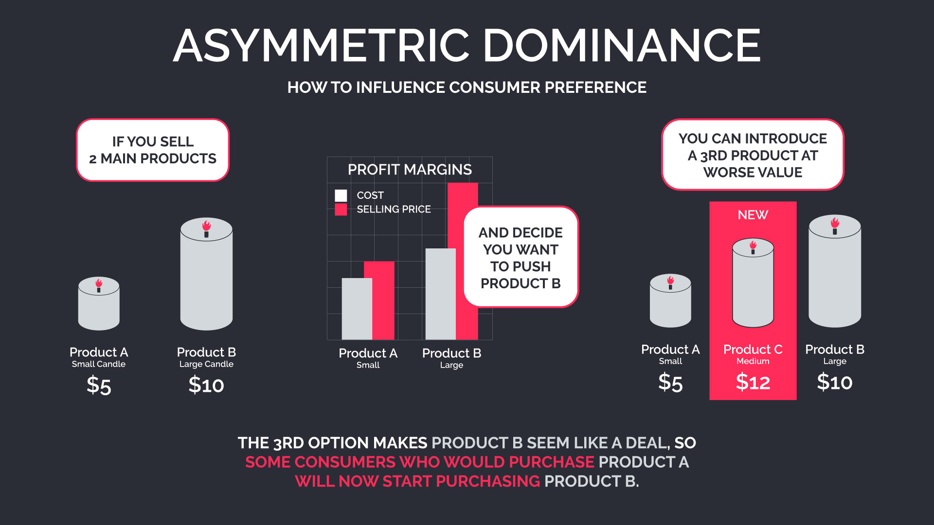
Asymmetric Dominance Effect
Also called the decoy effect, this theory can be a little confusing so let’s start with an example: let’s say we sell candles. We have 2 main product offerings:
A) 1 small Candle for $5
B) 1 large Candle for $10
People will either prefer Product B because it will last much longer, or prefer Product A because of the lower price. For our example, lets say our sales are usually split down the middle: 50% of customers usually purchase the larger candle, 50% purchase the smaller.
Now, let’s say we want to push Product B more, since we make a better profit on the larger candle. We can do this by introducing a decoy option: Product C.
C) 1 medium-sized Candle for $12
Obviously, this product is worse for the customer than Product B in both aspects: it costs more and you get less candle for it. So practically no one will purchase Product C, but studies have shown this will push more customers into buying Product B over Product A, since now Product B looks like a great deal. Your sales volume will not split 50% between Products A and B anymore – more like 60/40 or 70/30 in favor of Product A.
Psychology & Web Design
People are constantly innovating new ways to market. With just some basic understanding of human behavior we can start to fine tune our marketing efforts better and hopefully make more sales. We are already seeing the effects that big data will allow us to see even finer details in how people operate online and neuromarketing design.
Have you seen any new developments in marketing? Experienced any new technologies that change the way you think? Comment down below to share your experience!