For a lot of companies, branding is an integral element of success. A brand is a complex system with many moving parts. Every touchpoint should be carefully procured to match the company’s values. Of course, a strong design system won’t make a bad business successful, but a good company with terrible design won’t be likely to succeed either.
Like most teaching moments, it’s beneficial to have an example of what a successful model looks like. This guides smaller businesses to understand the right steps to take within their own branding.
Apple is not only a hugely lucrative company but is also known for its branding, making it a great case study.
Innovative & Emotional: Apple
Apple is a powerhouse in branding. It’s built its legacy on innovation and cultivating imagination. Remember their slogan “Think Different”. Setting itself apart, Apple began marketing toward a new tech audience. Instead of the cliché computer guy, Apple portrays itself as young and creative.
Apple plays into people’s emotions, selling them powerful ideologies and values over products. How does the idea of ‘breaking free’ manifest itself in the practical applications of a brand? Let’s take a look.
The Overall Look
Some argue that a lot of Apple’s success comes from the popularity of their brand rather than their products. How did they build this incredible brand loyalty?
With its power-to-the-people feel, it focuses on the aspirations of its customers, making it a humanist brand. The language Apple uses in its campaigns is less about the technical specs and more about the emotion the product evokes.
Not only that, but it also strives to remove the complexity from people’s lives. This simplicity can be seen in every application, like advertising, packaging, and product design. The modern styling of this simplicity also eludes to luxury, convincing people to pay more for Apple’s products than others on the market.
The Logo
While the current logo uses simple visuals, the original was a lot more complicated. Designed by Ronald Wayne, it depicted Isaac Newton sitting under an apple tree shown with the quote “Newton… a mind forever voyaging through strange seas of thought”.
In 1976, Rob Janoff created the shape of the logo we know now. The familiar apple was first filled with a rainbow, then went through several iterations until it reached the present monochromatic style. The uncomplicated look follows the feel of luxury, while the apple shape elicits the feeling of discovery and innovation.
Applications
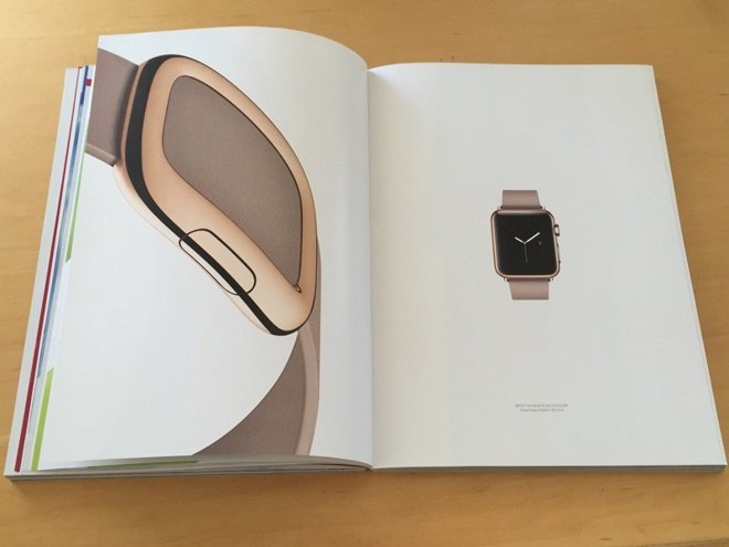
Let’s look at some advertisements. Shown not only in this magazine ad but pretty much all of their touchpoints, Apple utilizes a lot of white space around a focus on one central point. Often, they’ll use a large title with a short tagline subheading. This modern aesthetic is tied to a certain level of hipness and affluence.
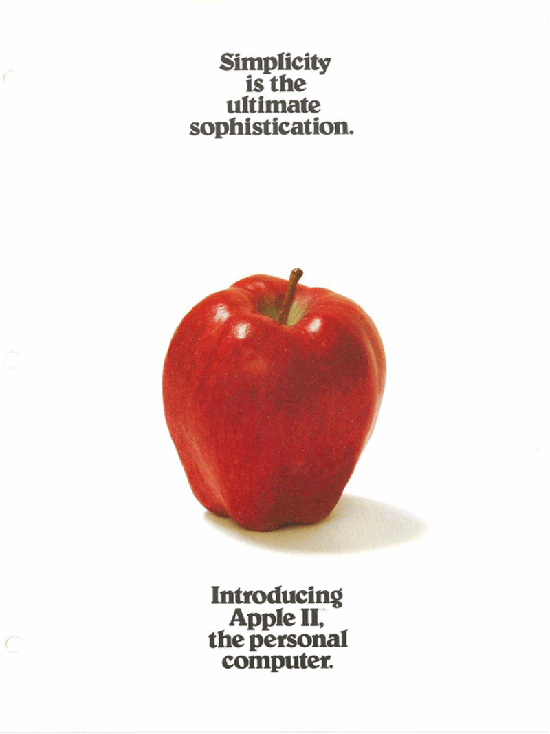
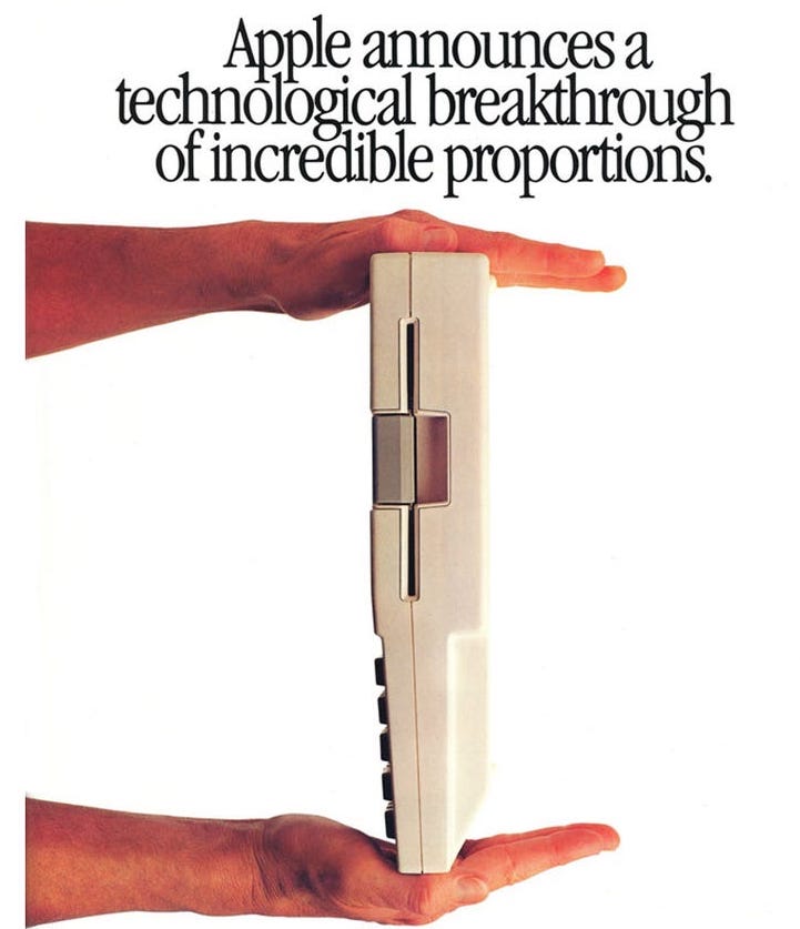
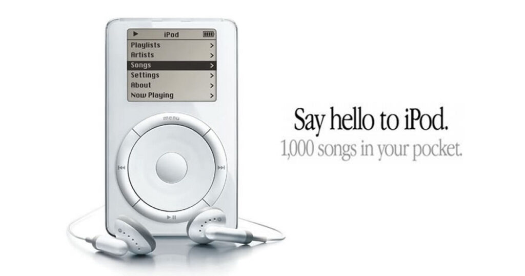
We’re seeing a rising trend of minimalism in branding, but Apple has been ahead of this trend for quite a while. You can see earlier advertisements follow an almost identical style. Unlike today, they strayed a bit from this depending on the ad, but you can see that as a whole they’ve stayed consistent throughout the years.
The Touchpoints
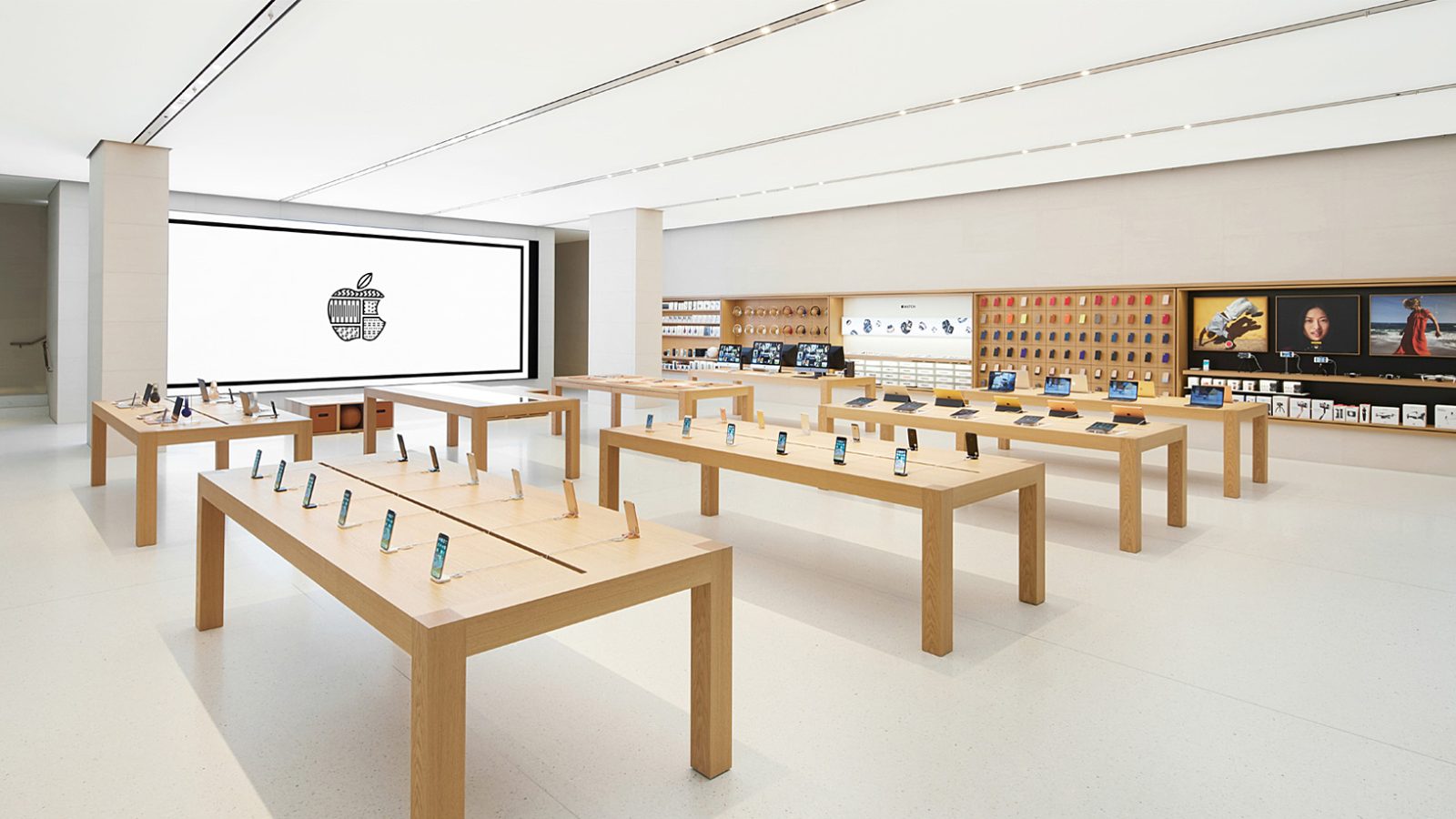
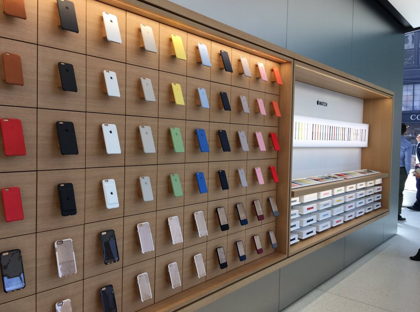
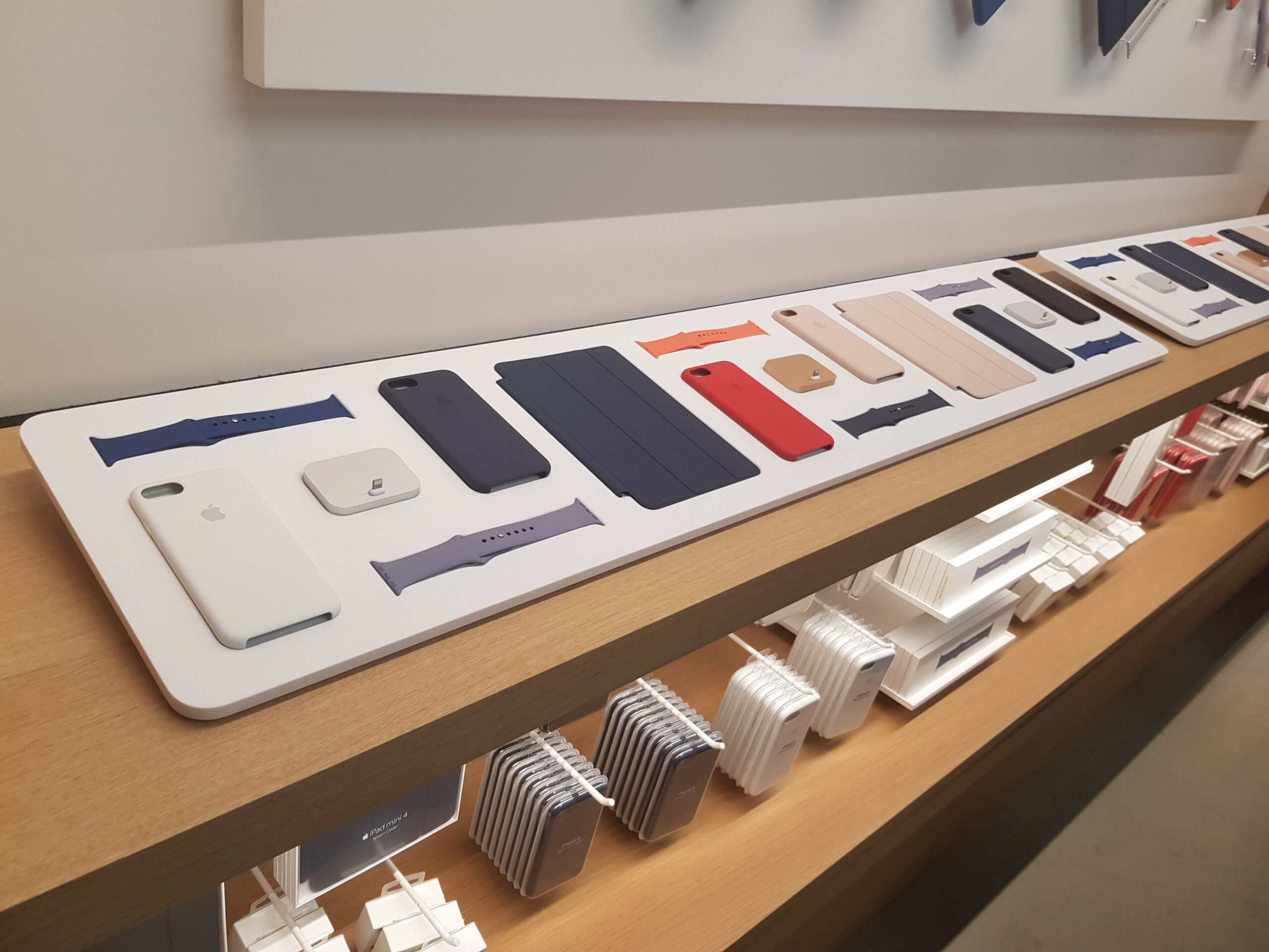
The Interiors
Every interaction with a customer is an opportunity to further brand integration.
William Arruda wrote for Forbes that “branding is the key to differentiating yourself from the competition, but if you don’t build your brand promise around reality or consistently live up to it, your branding efforts are pointless.” Therefore, each touchpoint should follow the system of the brand.
Apple is unwavering when demonstrating its values. Keeping its emphasis on white space, most of the interior is white, from floor to ceiling. The grid structure and minimal elements stick with the ideology of uncomplicating life. The modern lines, glass doors, and brightness exude a sleekness Apple uses to differentiate from the corporate world.
The stores’ setup ties into the humanistic elements of the brand. There’s no clear definition between employee area vs customer area. The tables differ from typical stores displays, inviting customers to congregate around products. Empty tables are designated for employees to help with technology issues. This feels more personal, like sitting with a friend.
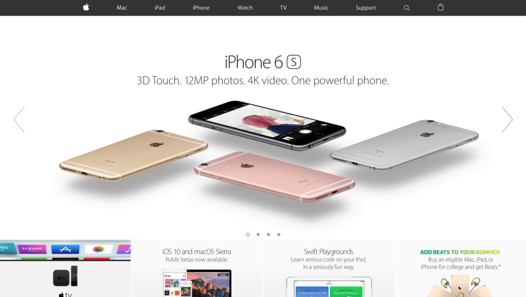
The Website
Even though a website and an interior are completely different mediums, it’s possible for elements to stay consistent across a variety of applications. Right off the bat, you can see similarities from the print ads shown earlier.
There’s the same focus on white space, a single focal piece, a title, and a short subheading. While the store interior does not imitate this exactly, the essence is the same.
As you scroll through their website, the grid organization from the store is used online. Overlapping elements are avoided. Instead, elements stay divided within square or rectangles that split the space equally.
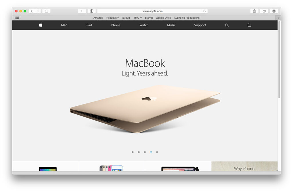
Other elements repeat as well. The photography stays relatively flat, there isn’t a whole lot of depth in the photos. This is another nod to simplicity.
Another theme seen throughout is a monochromatic palette, although blue is seen as an accent. Blue is used often in the tech industry, which is surprising due to Apple’s wish to differentiate itself. Perhaps it’s due to blue’s psychological connection to inspiration.
Often unnoticed but of great importance is typography. Apple uses a sans serif font in all of their current pieces. Sans serif is a mono-weight type, meaning the strokes are all one length. This not only makes it easier to read on websites but appears simplistic and modern as well. To establish a hierarchy, Apple uses different weights or sizes between headings, subheadings, and bodies.
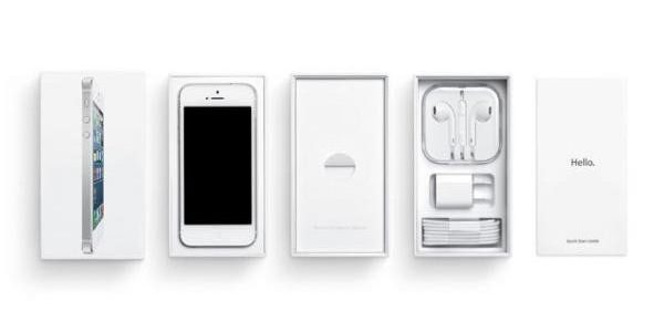
Packaging
The packaging of Apple products is no different from the rest of the brand. It keeps the same clear, straightforward, organized, and current aesthetic. Similar photography to the website is used on the outside of the boxes, as well as the structured text treatment.

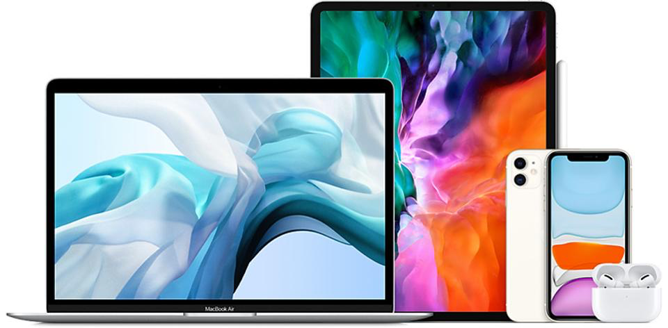
Product Design
The design structure doesn’t just apply to marketing and advertising, it’s a fundamental part of the brand. You’ll see the same principles applied to both the exterior of products as well as the interior software. You may look at these products and think you could’ve designed them, but the simple construction is anything but effortless.
“It takes a lot of hard work to make something simple, to truly understand the underlying challenges and come up with elegant solutions,” Steve Jobs said, according to the Smithsonian Magazine.
Commercials
Commercials are a big component of Apple’s branding. They made waves with their award-winning super bowl commercial titled “1984 Won’t Be Like 1984”. The commercial presents Apple as a disrupter to control, a chance to be unique. The video also sparked great curiosity as to what was to come from the company.
“This commercial was classically disruptive,” says Timothy de Waal Malefyt, a professor at Fordham University, to Business Insider. “This wasn’t a machine where you were going to be kowtowed in the workplace, this was a machine for the young, innovative, entrepreneurial mind. It really inspires the creative individual to break free and start something different.”
Focusing on the humanistic qualities of the brand, the “Shot on iPhone” campaign showcases a series of images and videos shot by actual people using an iPhone. It feels personal and attainable while encouraging people’s creative spirits.
Another famous campaign showcases Justin Long as a Mac and John Hodgman as a PC. In a series of videos called “Get a Mac”. The commercials focused on the weaknesses of a PC in comparison to a Mac. The PC character was nerdy, corporate, and awkward, while the Mac one was cool, relatable, and innovative.
Keep in Mind
They say good design goes unnoticed. Strong branding often feels natural and instinctual. An average person may not be able to list all of the design elements off the top of their head, but they’ll able to identify the brand instantly. This is important because customers typically makes their decision within 3-7 seconds. As seen with Apple, consistency is key.
Need help getting your own brand in tip top shape? We’re here to help! Get a free quote for your project.